By: Chris Beckett
Email: chrisbeckett8@gmail.com
ABSTRACT
Rfviz: An Interactive Visualization Package For Random Forests in R
Random forests are very popular tools for predictive analysis and data science. They work for both classification (where there is a categorical response variable) and regression (where the response is continuous). Random forests provide proximities, and both local and global measures of variable importance. However, these quantities require special tools to be effectively used to interpret the forest. Rfviz is a sophisticated interactive visualization package and toolkit in R, specially designed for interpreting the results of a random forest in a user-friendly way. Rfviz uses a recently-developed R package (loon) from the Comprehensive R Archive Network (CRAN) to create parallel coordinate plots of the predictor variables, the local importance values, and the MDS plot of the proximities. The visualizations allow users to highlight or brush observations in one plot and have the same observations show up as highlighted in other plots. This allows users to explore unusual subsets of their data and to potentially discover previously-unknown relationships between the predictor variables and the response.
- Introduction
- Background
- Rfviz Software Description
- Future work
- References
Introduction
Random forests (Breiman (2001)) are among the most popular data science tools because they are relatively fast (compared to neural networks), they tend to fit quite well with little tuning, and they work for deep or wide problems (large n or large p). However, random forests are sometimes criticized because they can be difficult to interpret.
Often researchers look at partial dependence plots (Friedman (2001)) to interpret a random forest. However, these show overall measures of the relationships between each predictor and the response. If interactions are present, partial dependence plots can be uninformative or even misleading (Martin (2014)).
Random forests provide proximities, and both local and global measures of variable importance. However, these quantities require special tools to be effectively used to interpret the forest. Rfviz is a sophisticated interactive visualization package and toolkit in R, specially designed for interpreting the results of a random forest in a user-friendly way. Rfviz uses a recently-developed package (loon) from the Comprehensive R Archive Network (CRAN) to create parallel coordinate plots of the predictor variables, the local importance values, and an MDS plot of the proximities. The visualizations allow users to highlight or brush observations in one plot and have the same observations show up as highlighted in other plots. This lets users explore unusual subsets of their data and potentially discover previously-unknown relationships between the predictor variables and the response.
This work is inspired by the Java package RAFT (Breiman and Cutler (2004)), which had the same purpose but was seldom used because it was not easily accessible by users. Other methods for visualizing random forests are reported by (Quach (2012)) and (H Wickham (2014)).
In this report we describe the rfviz package and show how it can be used to extract meaningful information from a random forest.
Section 2 gives background on random forests and on the plots produced by the rfviz package. Section 3 explains the syntax and illustrates the use of rfviz for interpreting random forests. Section 4 provides suggestions for future development.
Rfviz was authored and created by Chris Beckett. The graphical user interface toolkit as well as the separate functions for graphs and plots were interfaced into R through an R package called loon, which uses Tcl/Tk code to create the plots. Chris used loon to create the main 2x2 viewing grid to include the two parallel coordinate plots as well as the 2-D scatterplot. As well, rfviz was created to have two functions, one to prepare the randomForest data called rf_prep and another to plot the prepared data in the 2x2 grid called rf_viz. The author of rfviz also created the functionality to view what data is being selected in real time from within the R console. The funcionalities to change the selecting color and the options to view any combination of the plots was additionally added within rfviz.
Installation
This package is available on CRAN. Use install.packages(“rfviz”) within R to download it.
If installation fails, make sure you have the most recent version of R, make sure your computer has the most recent update and install xtools if you are using a Mac, using this guide: “http://osxdaily.com/2014/02/12/install-command-line-tools-mac-os-x/”.
If you wish to download it from github, use devtools::install_github(“chrisbeckett8/rfviz”) and library(rfviz) to download and use it in R. If you do not already have devtools installed, use install.packages(“devtools”), and library(“devtools”) before installing rfviz.
For the source code on Github, visit https://github.com/chrisbeckett8/rfviz.
Background
Random Forests
Random forests (Breiman (2001)) fit a number of trees (typically 500 or more) to regression or classification data. Each tree is fit to a bootstrap sample of the data, so some observations are not included in the fit of each tree (these are called out of bag observations for the tree). Independently at each node of each tree, a relatively small number of predictor variables (called mtry) is randomly chosen and these variables are used to find the best split. The trees are grown deep and not pruned. To predict for a new observation, the observation is passed down all the trees and the predictions are averaged (regression) or voted (classification).
Data Sets
There are three data sets used within this report for examples:
Iris:
The iris data is a famous data set built-in to R. It gives the measurements of sepal length and width and petal length and width in centimeters, for 50 flowers from a total of 3 species. For more information use ?iris within the R console. (Fisher (1936))
Mtcars:
The mtcars data set is a built-in data set within R. It includes fuel consumption in miles per gallon, along with 10 variables that describe the design of the specific car for 3 different automobiles. Use ?mtcars within R to obtain more information. (Henderson and Velleman (1981))
Glass:
The glass data set is from the UCI Machine Learning Respotory. The response variable is the type of glass and is the tenth column of the data. The descriptor variables are the first 9 columns and are characteristics of each glass. It is built-in to this package. Simply use data(glass) to load it after installing the rfviz package. (Dheeru and Karra Taniskidou (2017))
Variable Importance
A local importance score is obtained for each observation in the data set, for each variable. To obtain the local importance score for observation i and variable j, randomly permute variable j for each of the trees in which observation i is out of bag, and compare the error for the variable-j permuted data to actual error. The average difference in the errors across all trees for which observation i is out of bag is its local importance score.
The (overall) variable importance score for variable j is the average value of its local importance scores over all observations.
Proximities
Proximities are the proportion of time two observations end up in the same terminal node when both observations are out of bag. The proximity scores are obtained for all combinations of pairs of observations, giving a symmetric proximity matrix.
Note: It is recommended to use 9 or 10 times more trees when dealing with proximities, since it the the proprotion of when two observations are both out of bag. This is to ensure each observation is able to be compared with the subsequent observations.
Parallel Coordinate Plots
Parallel coordinate plots are used for plotting observations on a handful of variables. The variables can be discrete or continuous, or even categorical. Each variable has its own axis and these are represented as equally-spaced parallel vertical lines. Usually, the axes extend from the minimum to the maximum of the observed data values although other definitions are possible. A given observation is plotted by connecting its observed value on each of the variables using a piecewise linear function.
Static parallel coordinate plots are not particularly good for discovering relationships between variables because the display depends strongly on the order of the variables in the plot. In addition, they suffer very badly from overplotting for large data sets. However, by brushing the plot (highlighting subsets of observations in a contrasting color) parallel coordinate plots can be useful in investigating unusual groups of observations and relating the groups to high/low values of the variables.
Figure 1 shows an example of a parallel coordinate plot for the mtcars data in R. Each line represents one car, and the different attributes for the car are plotted on the axes.
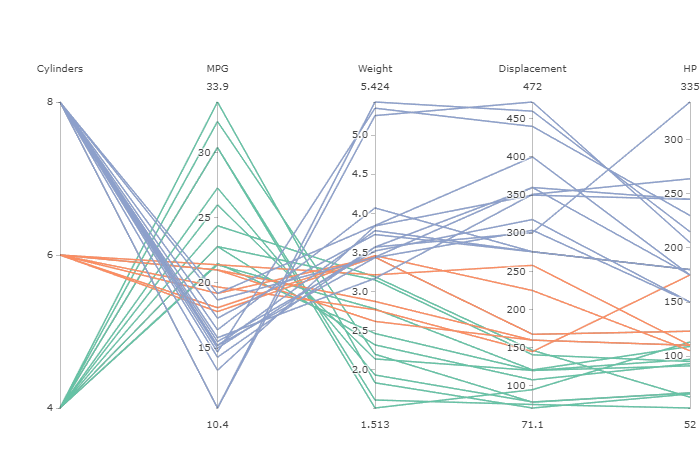
Figure 1: Parallel coordinate plot
Proximity Plots
The symmetric proximity matrix produced by random forests can be converted to a dissimilarity matrix by subtracting from the identity matrix. This matrix is then used to obtain a multidimensional scaling (MDS) plot using classical MDS, which is equivalent to principal components. Only the first three MDS coordinates are used, giving a plot that can be rotated to investigate the 3-dimensional structure. Points that appear close on this plot represent observations that the random forest perceives as similar because they frequently end up in the same terminal nodes.
Rfviz Software Description
Rfviz was authored by Chris Beckett.
Rfviz consists of two functions:
-
rf_prep(x, y, …)
-
rf_viz(rfprep, input = TRUE, imp = TRUE, cmd = TRUE, hl_color = “orange”)
The function rf_prep() runs the random forest and extracts the necessary components for visualization while rf_viz() takes the output of rf_prep() and produces the chosen plots.
The arguments for rf_prep are:
-
x: the predictor variables.
-
y: the response variable.
-
… : to change or include any parameter of Random Forests besides localImp=True, or proximity=True, as those are vital to the output of the graphs.
The output of rf_prep is:
-
rf: the random forest object with relevant elements for plotting.
-
x: the predictor variables.
-
y: the response variable.
The arguments for rf_viz are:
-
input: set to TRUE to show a parallel coordinate plot of the input data.
-
imp: set to TRUE to show a parallel coordinate plot of the local importance.
-
cmd: set to TRUE to show an MDS plot of the proximities.
-
hl_color: the highlighting color for observations selected on one of the plots.
The output of rf_viz is a loon object which can be used to obtain information on which observations have been selected in the interactive plots at a given time (see Section 3.4.4).
Plots Produced by Rfviz
Parallel coordinate plot of the input data.
The predictor variables are plotted in a parallel coordinate plot. The observations are colored according to their value of the response variable. Brushing on this plot allows investigators to examine the input data interactively and look for unusual observations, outliers, or any obvious patterns between the predictors and the response. Often this plot is used in conjunction with the local importance plot, which allows users to focus more heavily on the predictors that are important for a given group of observations.
Parallel coordinate plot of the local importance scores.
The local importance scores of each observation are plotted in a parallel coordinate plot. Brushing observations with high local importance can allow the user to look at the corresponding variable on the raw input parallel coordinate plot and observe whether the variable has high or low values, allowing an interpretation such as ``for this group the most important variable is variable j”.
Rotational scatterplot of the proximities.
This plot allows the user to select groups of observations that appear to be similar and brush them, with the corresponding observations showing up in the two parallel coordinate plots. In classification, for example, if the user brushes a group of observations that are from class 1, they can then examine the local importance parallel coordinate plot. Variables that are important for classifying the group correctly will be highlighted and any variables that have high importance can then be studied in the raw input parallel coordinate plot, to see whether high or low values of the important variable(s) are associated with the group.
Random Forest Classification Example: the iris data
Syntax for growing the forest and producing the plots for random forest classification of the iris data is as follows:
rfprep_iris <- rf_prep(x=iris[,1:4], y=iris$Species, seed=2894)
rf_viz(rfprep_iris)
Two windows will appear, a plot window and a Loon Inspector window, as seen in Figure 2. More information about the Loon Inspector is provided in the loon documentation. The colors represent the three species of iris.
Note:
-
the response variable, iris$Species, is a factor. If it was not already a factor, it would be necessary to convert it to a factor using as.factor().
-
in this report, the seed is set for reproducibility of the random forest. It is optional.
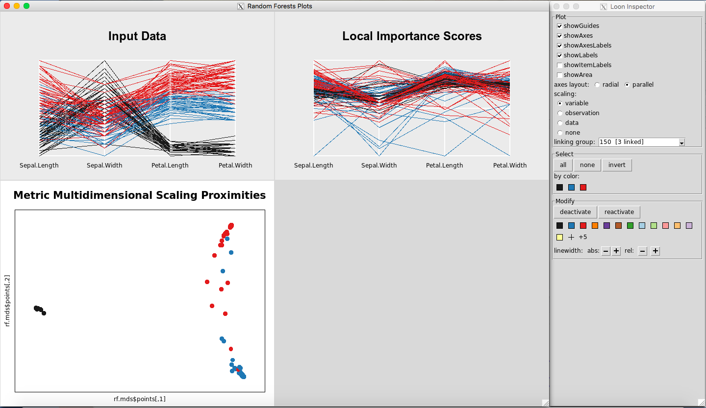
Figure 2: Rfviz plots for the iris data
The random forests object produced by rf_prep can be examined using the rf element of the output:
rfprep_iris$rf
##
## Call:
##  randomForest(x = x, y = y, localImp = TRUE, proximity = TRUE,      seed = 2894)
##                Type of random forest: classification
##                      Number of trees: 500
## No. of variables tried at each split: 2
##
##         OOB estimate of  error rate: 4.67%
## Confusion matrix:
##            setosa versicolor virginica class.error
## setosa         50          0         0        0.00
## versicolor      0         47         3        0.06
## virginica       0          4        46        0.08
Random Forest Regression Example: the mtcars data
To grow the forest and view the plots for the mtcars data:
rfprep_mtcars <- rf_prep(x=mtcars[,-1], y=mtcars$mpg, seed=2894)
rf_viz(rfprep_mtcars)
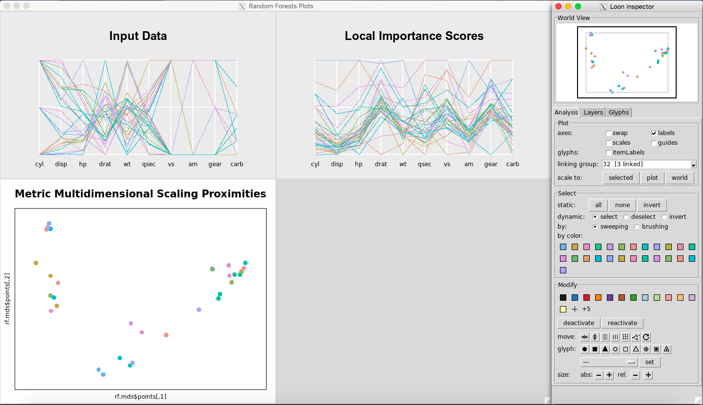
Figure 3: Rfviz plots for the mtcars data
The plots are shown in Figure 3. The colors represent the levels of the response variable, mtcars$mpg. Note that the parallel coordinate plot of the input data only has two outcomes for variables vs and am, and three outcomes for cyl and gear. This is why multiple lines look like one line.
As before, the random forests object produced by rf_prep can be examined using the rf element of the output:
rfprep_mtcars$rf
##
## Call:
##  randomForest(x = x, y = y, localImp = TRUE, proximity = TRUE,      seed = 2894)
##                Type of random forest: regression
##                      Number of trees: 500
## No. of variables tried at each split: 3
##
##           Mean of squared residuals: 5.828695
##                     % Var explained: 83.44
Interacting with the Plots
Brushing:
Any point(s) or line(s) that are brushed with the left mouse button in any of the plots will have the corresponding observations selected and highlighted in all the plots.
Selecting a square of points on the Metric Multidimensional Scaling Proximities Plot is illustrated in Figure 4. Selecting multiple lines on the Input Data Plot is illustrated in Figure 5.
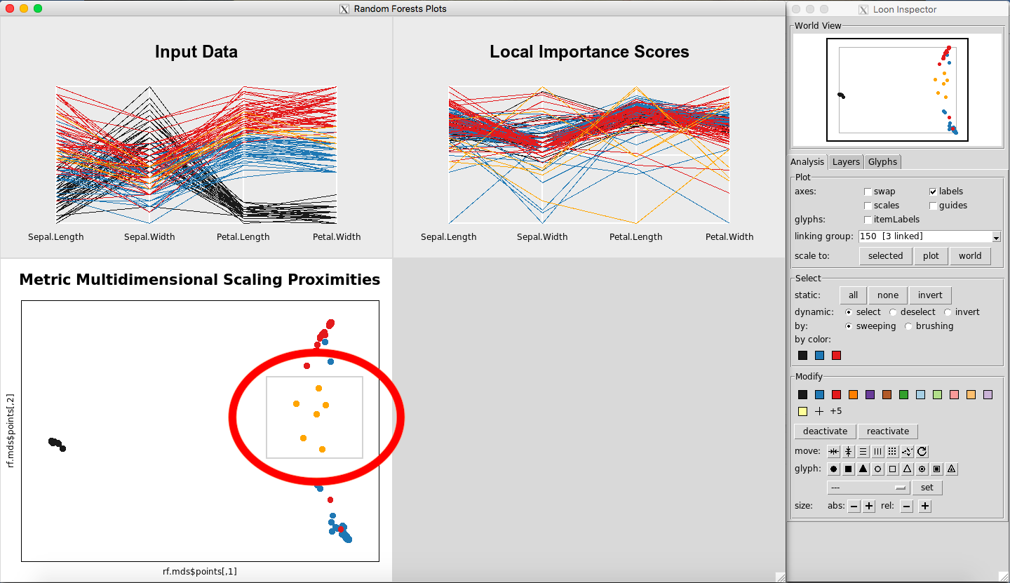
Figure 4: Selecting points on the MDS plot
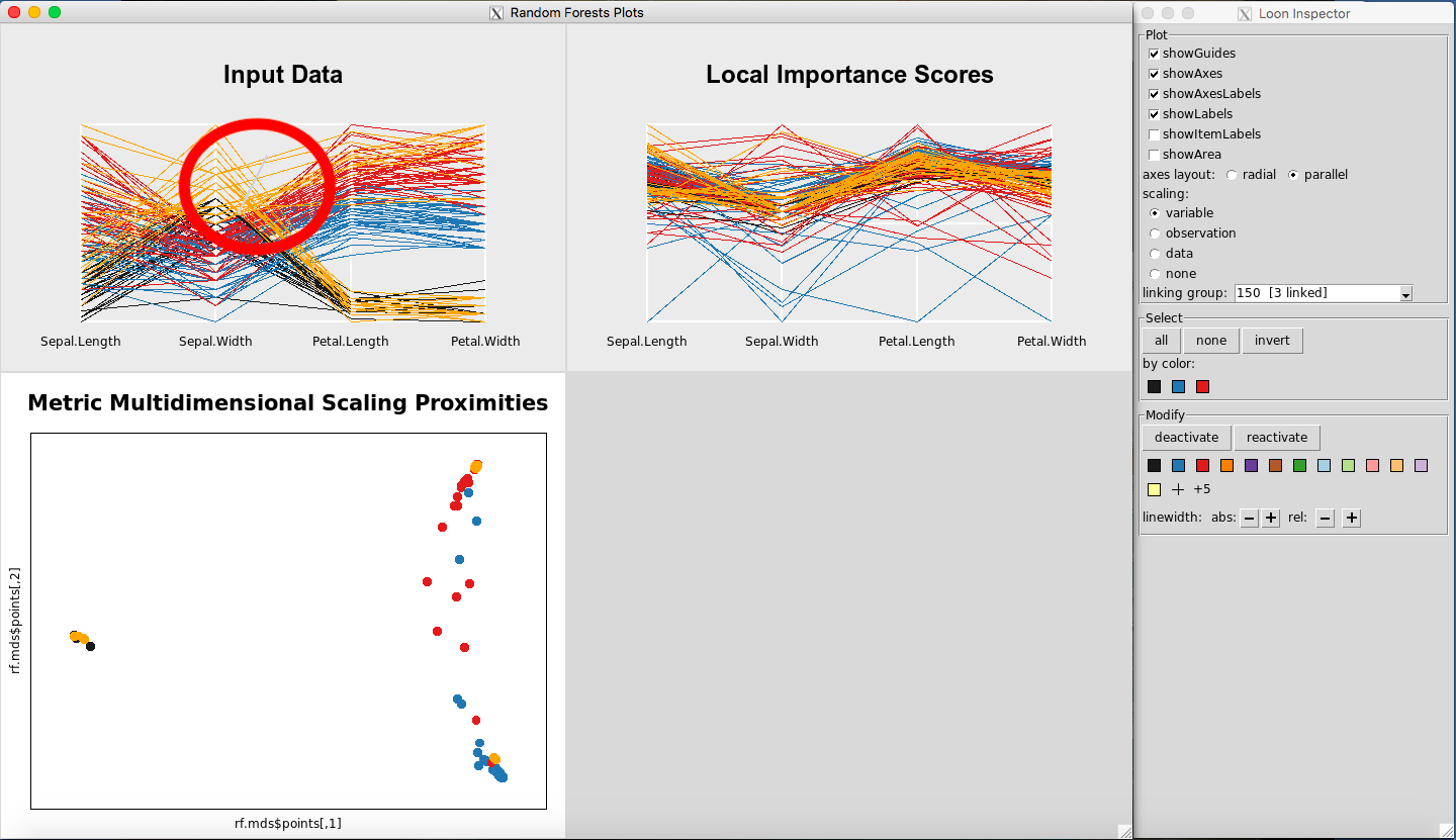
Figure 5: Selecting points on the Input Data Plot
Removing Observations from the Plots
Any point(s) selected of any of the plots will be omitted from all plots using the “deactivate” button in the “Modify” section of the Loon Inspector. Figure 6shows the result after pressing the “deactivate” button for Figure 5. This can be done in successive fashion (Figure 7and Figure 8) until the desired data is left on the plot. To place all of the data back into the plot, simply select “reactivate” button in the “Modify” section of the Loon Inspector (Figure 9).
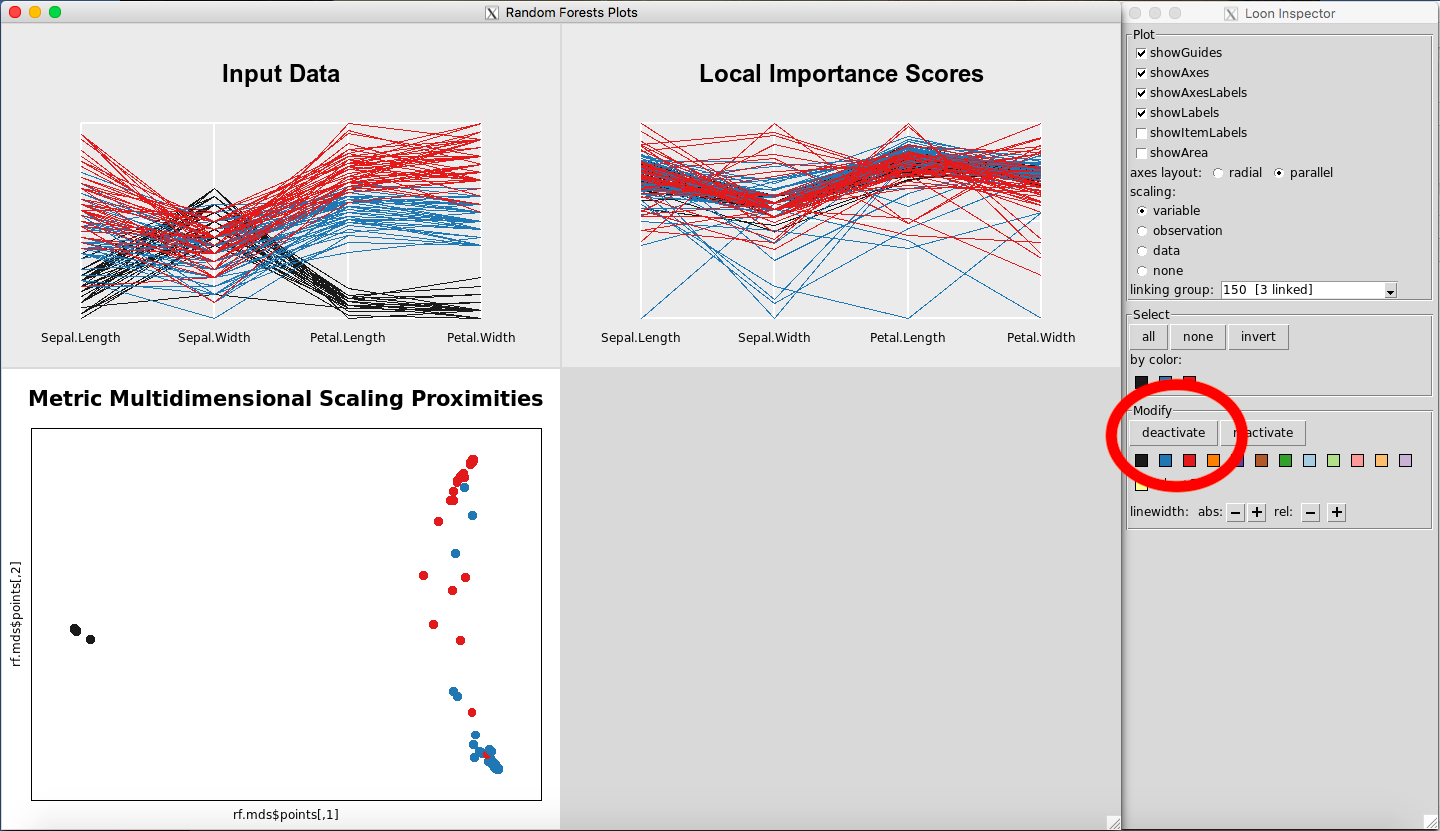
Figure 6: Remove data using the deactivate button
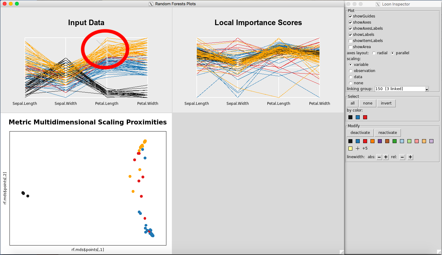
Figure 7: Select more data
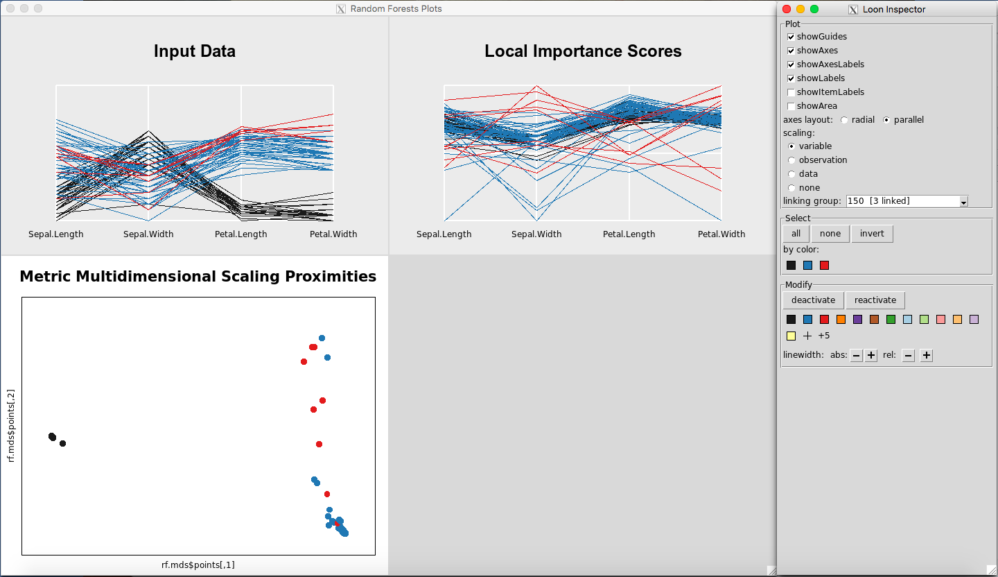
Figure 8: Selected data are removed
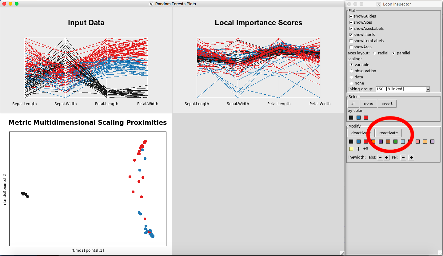
Figure 9: Revert to the original plots
Rotating and Panning the MDS Plot
Starting with the mouse hovering over the MDS plot, horizontal rotations can be performed as follows:
- On both Mac and Windows, hold control and use the zoom button on the mouse or the zoom finger swipe on a laptop trackpad to rotate to your liking.
Figure 10 shows the MDS plot after horizontal rotation.
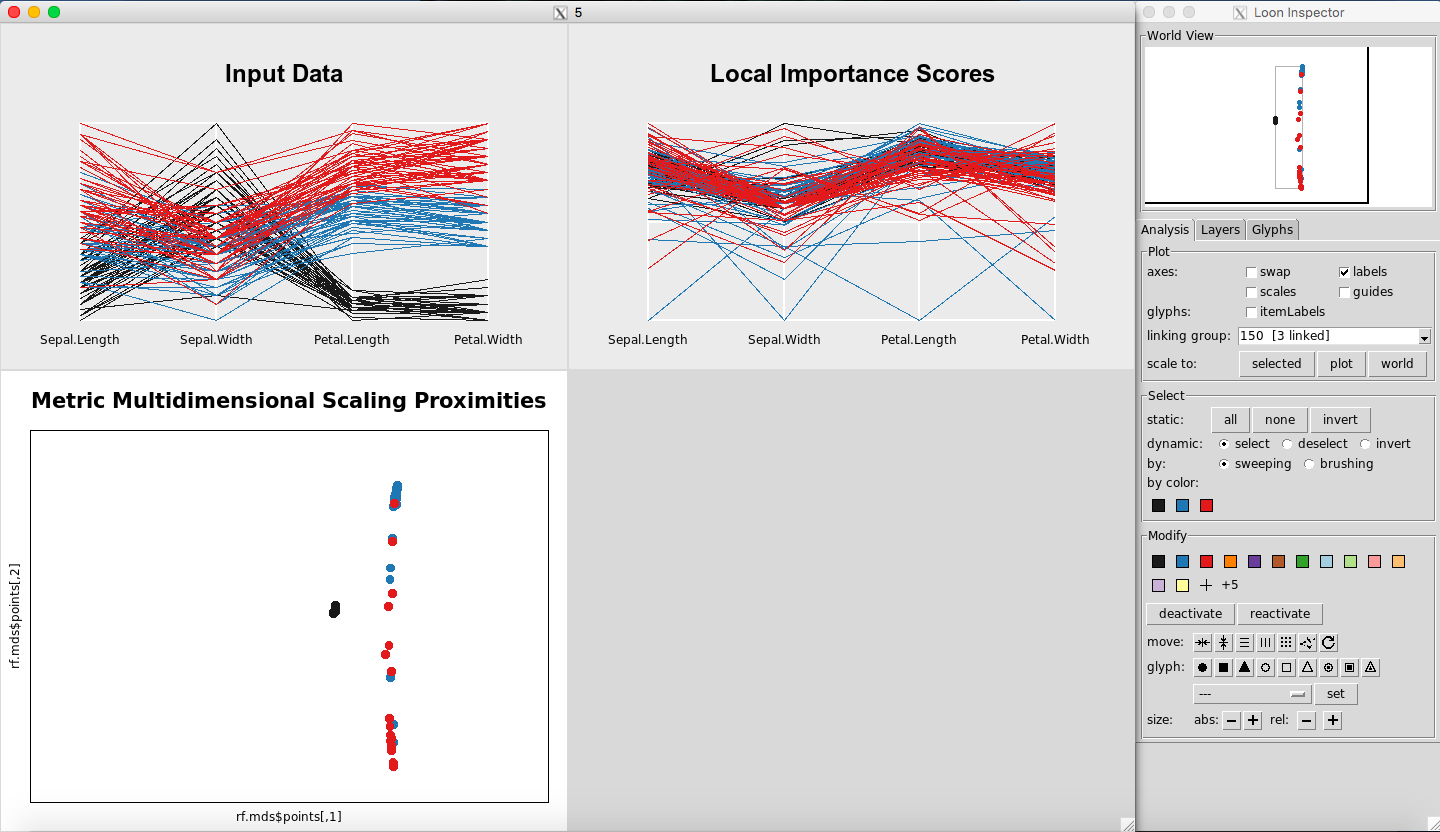
Figure 10: MDS plot after horizontal rotation
Likewise, to rotate the plot vertically:
-
On a Mac, hold the command key and use the zooming functionality on your mouse or laptop.
-
On a Windows, hold the shift key instead of the command key.
To pan the plot horizontally:
- On both Mac and Windows, hold control and the right-click button, and move your mouse left and right.
Figure 11 shows the MDS plot after a horizontal pan.
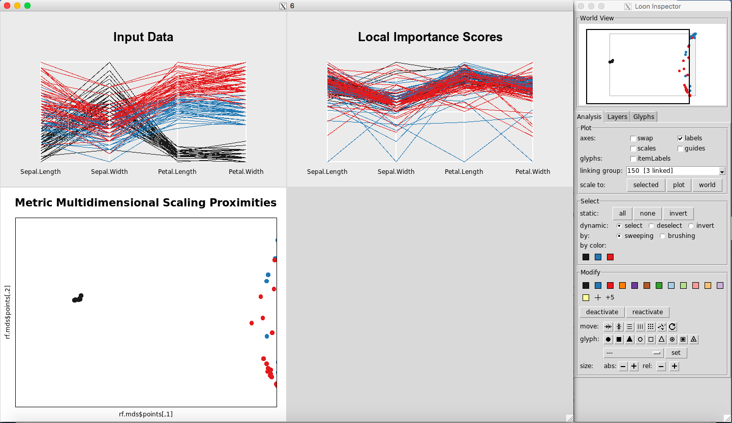
Figure 11: MDS plot after horizontal pan
To pan the plot vertically:
-
On a Mac, hold the command key while holding the right-click, and move the mouse up and down.
-
On a Windows, hold the shift key instead of the command key at the same time as a right-click, and move the mouse up and down.
Saving Selected Data
When observations are selected in any of the plots they can be extracted and used in R. This must be done while the plots are still open in rfviz. It is done by storing the rfviz results in a variable:
rfiris <- rf_viz(rfprep_iris)
To view the selected data from Figure 5, if the rfviz object was stored as rfiris, we would do:
iris[rfiris$input['selected'], ]
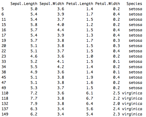
Figure 20: Selected data from Figure 5
Selecting All or None of the Data
To select all the data, in the Select portion of the Loon Inspector, click on “all” (Figure 23). To select none of the data, in the Select portion of the Loon Inspector, click on “none” (Figure 24).
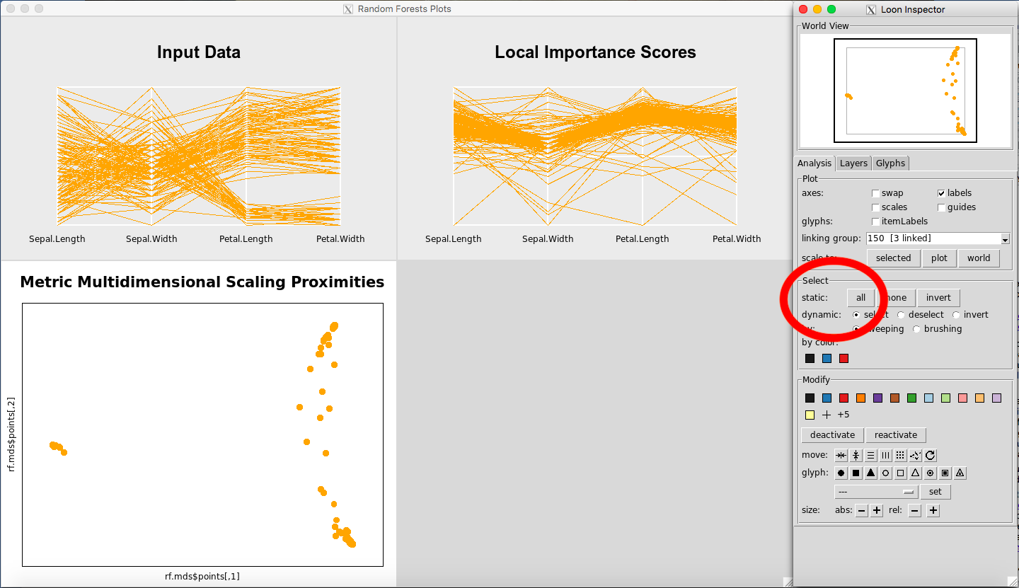
Figure 23: Selecting all the data
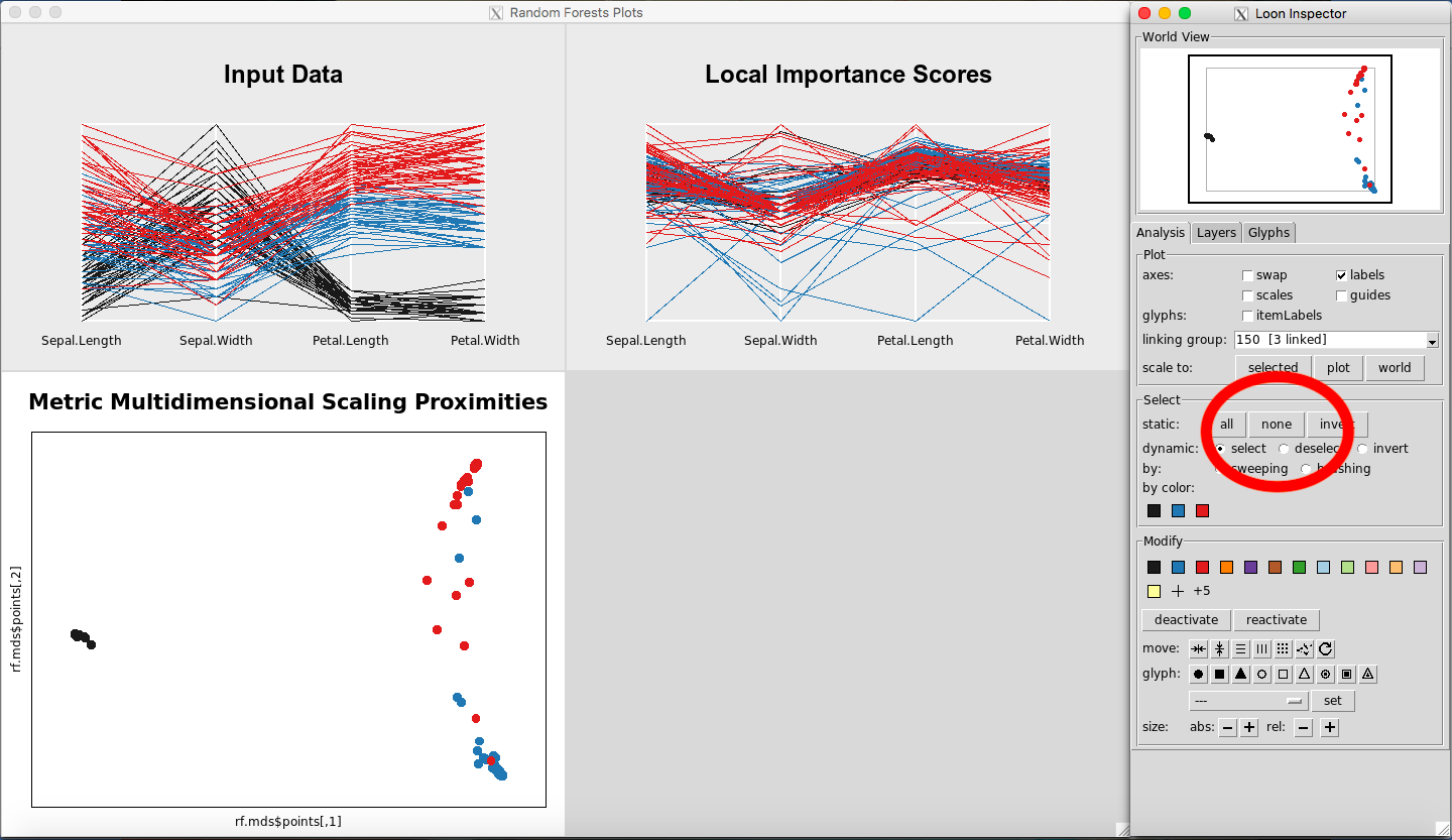
Figure 24: Selecting none of the data
Selecting Classes by Color
In the Select portion of the Inspector, select one of the colors under the Select: “By Color” section. This will select the class corresponding to that color, for each of the plots in view.
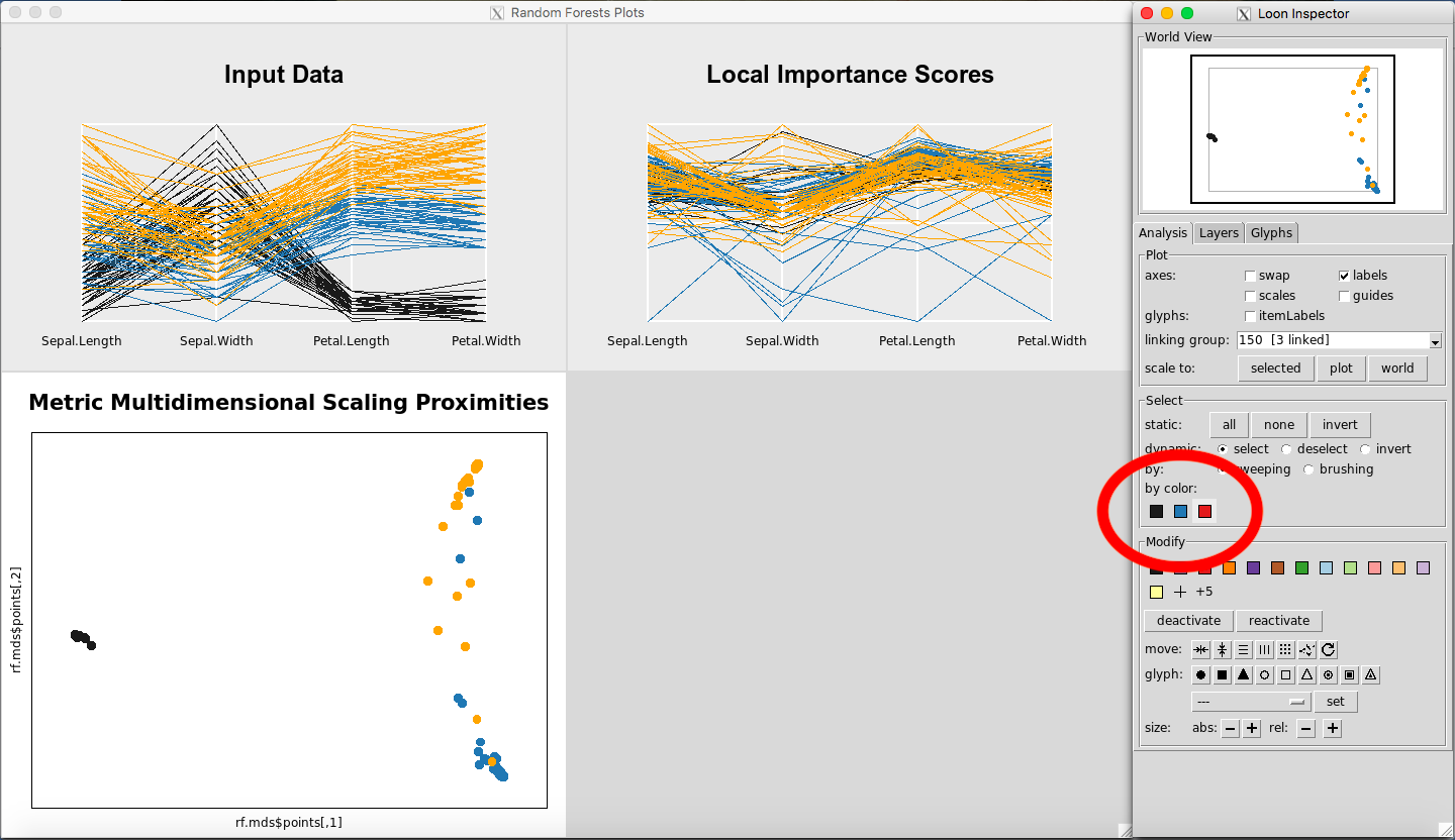
Figure 25: Selecting classes by color
Switching Between Loon Inspectors
When you click on a plot, the default Loon Inspector, which is associated with the MDS plot, will change. For example, if you open the three plots (Figure 26), and click anywhere on the Input Data Plot, the Loon Inspector will change to control the parallel coordinate plots (Figure 27). This change is not usually noticeable because any option selected on the Input Data Plot will automatically change the Local Importance Score Plot as well. It is only with the Classic Multidimensional Scaling Plot that this matters, because it has different options in the Inspector the other Inspector does not have.
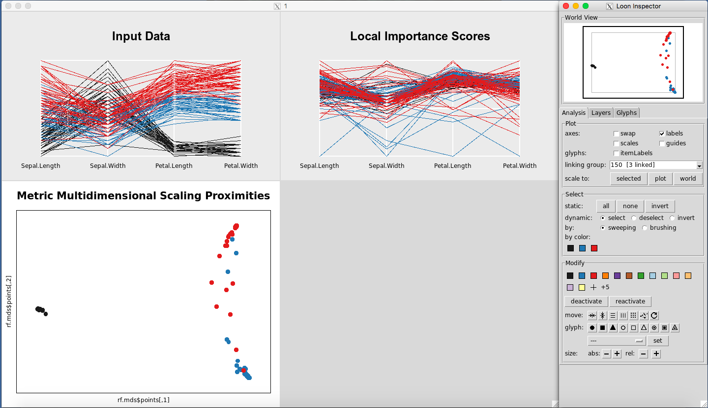
Figure 26: Rfviz plots with the default Loon Inspector (associated with the MDS plot)
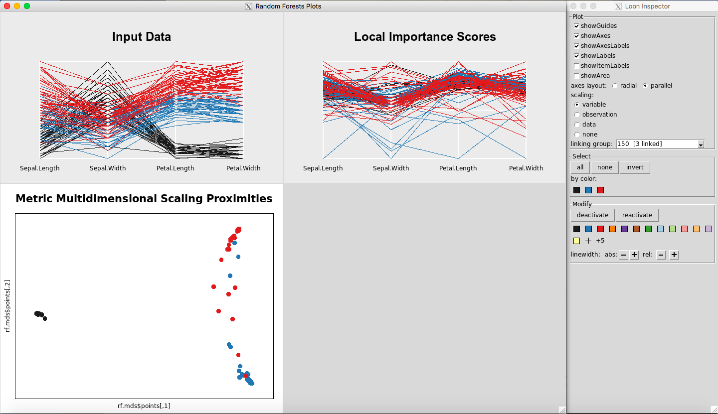
Figure 27: Rfviz plots with the parallel coordinate Loon Inspector (associated with the Input and Variable Importance plots)
Changing data points to glyphs, etc. on the MDS plot
To change to glyphs, select a rectangle of observations on the MDS Plot (Figure 28). Click on a glyph button, for example, the triangle button, (Figure 29). To revert to normal, select the circle again on the glyph section.
Figure 28: Selected observations
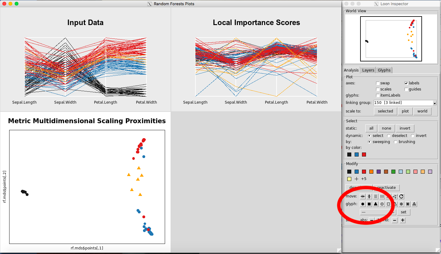
Figure 29: Changing to triangle glyphs
Scaling Options for the Parallel Coordinate Plots
To change the scaling options, select the Input Data Plot or the Local Importance Score Plot so that the corresponding loon inspector appears (Figure 31).
Figure 31: Selecting the Input Data plot makes the parallel coordinate Loon Inspector Plot appear
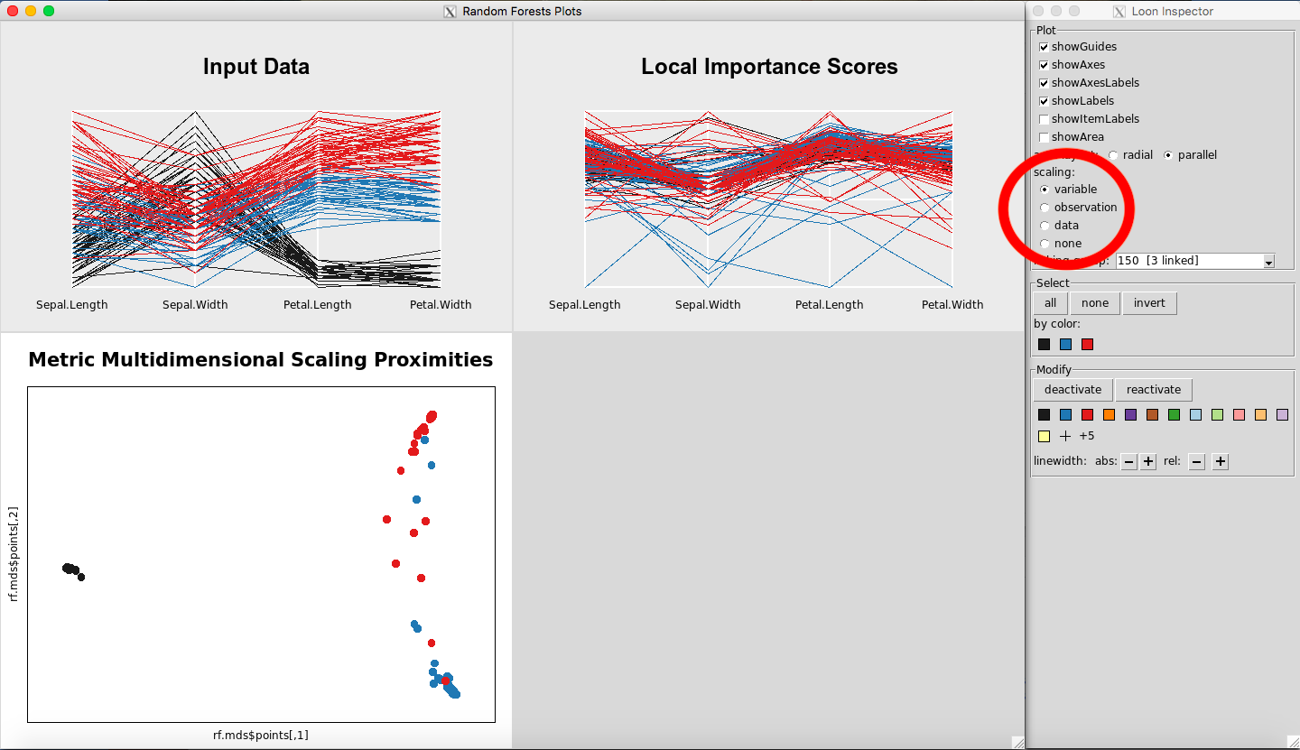
Figure 32: Changing the scales of the parallel coordinate plots
The scaling section of the loon inspector (Figure 32) defines how the data is scaled. The axes display 0 at one end and 1 at the other. For the following explanation assume that the data is in an nxp dimensional matrix. The scaling options are then:
-
Variable: per column scaling
-
Observation: per row scaling
-
Data: whole matrix scaling
-
None: do not scale
Case Study: the glass data
This example is using the glass dataset from the UC Irvine Machine Learning Data Set Respository. The data set is included in the rfviz package. The response is the tenth column of the dataset, which gives the type of glass. The type of glass needs to be predicted from the predictor variables in the first nine columns.
The goal is to use random forest classification to investigate the relationship between each type of glass and what about that class made it classify the way it did. Code to run the random forest and show the results is given below.
rfprep_glass <- rf_prep(x=glass[,-10], y=as.factor(glass[, 10]), seed=2894)
rfprep_glass$rf
##
## Call:
##  randomForest(x = x, y = y, localImp = TRUE, proximity = TRUE,      seed = 2894)
##                Type of random forest: classification
##                      Number of trees: 500
## No. of variables tried at each split: 3
##
##         OOB estimate of  error rate: 20.09%
## Confusion matrix:
##    1  2 3  5 6  7 class.error
## 1 62  6 2  0 0  0   0.1142857
## 2 10 62 1  1 1  1   0.1842105
## 3  8  4 5  0 0  0   0.7058824
## 5  0  2 0 10 0  1   0.2307692
## 6  1  1 0  0 7  0   0.2222222
## 7  1  3 0  0 0 25   0.1379310
The output shows the out-of-bag classification error and the confusion matrix with the 6 different classes or types and the class.error for each class. But what about those classes makes the data different from the others? How do we interpret this other than say these are our 6 classes and this is our error?
Rfviz can help to answer some of those questions. View the three plots using:
rfglass <- rf_viz(rfprep_glass)
The results are given in Figure 12. To select a given class, select the color on the Loon Inspector section labeled “by color”. For selecting the right-most color, the results are given in Figure 13.
Figure 12: Rfviz plots for the glass data
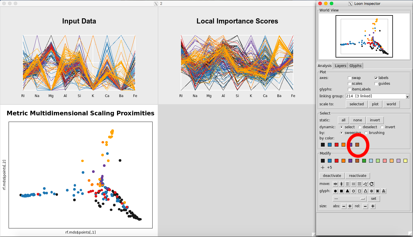
Figure 13: Selecting Glass Type 7
To see which class was selected, while the plots are still up, return to the R console, and use this line of code:
glass[rfglass$input['selected'], ]
##          RI    Na   Mg   Al    Si    K   Ca   Ba   Fe Type
## 186 1.51131 13.69 3.20 1.81 72.81 1.76 5.43 1.19 0.00    7
## 187 1.51838 14.32 3.26 2.22 71.25 1.46 5.79 1.63 0.00    7
## 188 1.52315 13.44 3.34 1.23 72.38 0.60 8.83 0.00 0.00    7
## 189 1.52247 14.86 2.20 2.06 70.26 0.76 9.76 0.00 0.00    7
## 190 1.52365 15.79 1.83 1.31 70.43 0.31 8.61 1.68 0.00    7
## 191 1.51613 13.88 1.78 1.79 73.10 0.00 8.67 0.76 0.00    7
## 192 1.51602 14.85 0.00 2.38 73.28 0.00 8.76 0.64 0.09    7
## 193 1.51623 14.20 0.00 2.79 73.46 0.04 9.04 0.40 0.09    7
## 194 1.51719 14.75 0.00 2.00 73.02 0.00 8.53 1.59 0.08    7
## 195 1.51683 14.56 0.00 1.98 73.29 0.00 8.52 1.57 0.07    7
## 196 1.51545 14.14 0.00 2.68 73.39 0.08 9.07 0.61 0.05    7
## 197 1.51556 13.87 0.00 2.54 73.23 0.14 9.41 0.81 0.01    7
## 198 1.51727 14.70 0.00 2.34 73.28 0.00 8.95 0.66 0.00    7
## 199 1.51531 14.38 0.00 2.66 73.10 0.04 9.08 0.64 0.00    7
## 200 1.51609 15.01 0.00 2.51 73.05 0.05 8.83 0.53 0.00    7
## 201 1.51508 15.15 0.00 2.25 73.50 0.00 8.34 0.63 0.00    7
## 202 1.51653 11.95 0.00 1.19 75.18 2.70 8.93 0.00 0.00    7
## 203 1.51514 14.85 0.00 2.42 73.72 0.00 8.39 0.56 0.00    7
## 204 1.51658 14.80 0.00 1.99 73.11 0.00 8.28 1.71 0.00    7
## 205 1.51617 14.95 0.00 2.27 73.30 0.00 8.71 0.67 0.00    7
## 206 1.51732 14.95 0.00 1.80 72.99 0.00 8.61 1.55 0.00    7
## 207 1.51645 14.94 0.00 1.87 73.11 0.00 8.67 1.38 0.00    7
## 208 1.51831 14.39 0.00 1.82 72.86 1.41 6.47 2.88 0.00    7
## 209 1.51640 14.37 0.00 2.74 72.85 0.00 9.45 0.54 0.00    7
## 210 1.51623 14.14 0.00 2.88 72.61 0.08 9.18 1.06 0.00    7
## 211 1.51685 14.92 0.00 1.99 73.06 0.00 8.40 1.59 0.00    7
## 212 1.52065 14.36 0.00 2.02 73.42 0.00 8.44 1.64 0.00    7
## 213 1.51651 14.38 0.00 1.94 73.61 0.00 8.48 1.57 0.00    7
## 214 1.51711 14.23 0.00 2.08 73.36 0.00 8.62 1.67 0.00    7
We see that this color is Glass Type 7. Returning to the graphs, for the Local Importance Score Plot, you can see that the values for Barium are really important for Glass Type 7 (Figure 15). This seems to differentiate it the most from from the other Glass Types.
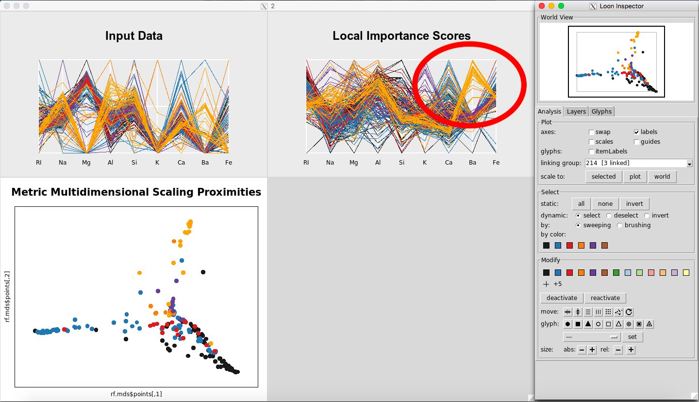
Figure 15: Barium is important for Glass Type 7
Looking at the parallel coordinate plot of the Input Data (Figure 16) shows that the values for Barium are generally higher for Glass Type 7 than for the other classes.
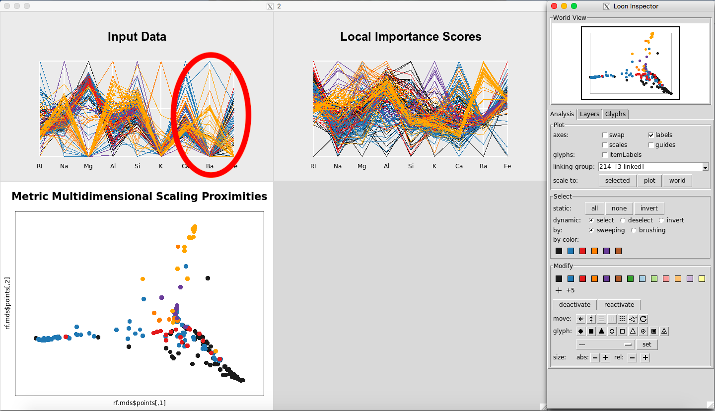
Figure 16: Values for Barium are higher for Glass Type 7
Further, in the plot of the Classical Metric Multidimensional Scaling Proximities (Figure 17), you can see how Glass Type 7 is grouped together in comparison to the other groups.
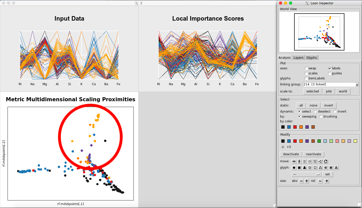
Figure 17: MDS plot showing Glass Type 7
Although in this particular example, one might look at the data set and see this difference between the classes with the naked eye, using the three plots in this way can make interpretation of the Random Forests results much easier and more efficient.
How could this be applied to other data sets? Imagine if you had a data set of autism, with the response variable being 1, “having autism” or 0, “not having autism”, with predictor variables of alleles. For those who have autism, you could see what alleles are most important to having a classification of 1, “having autism”, or 0, “not having autism”. Through this, one could see which alleles are associated with the classification of a positive or negative diagnosis. The same logic as above could be applied to any field or data set to really get a sense of why data is classifying the way it is and what it means.
Future work
One idea would be to include the response variable on the Input Data parallel coordinate plot. Another would be to display the overall variable importance in the bottom right corner of the plotting window, although the user can see this in the usual way from the $rf output of rf_prep. For datasets with more than a few variables, the parallel coordinate plots could show only the most important predictors. Finally, for datasets with lots of observations, the parallel coordinate plots could use transparency to help with overplotting.
References
Breiman, L. 2001. “Random Forests.” Machine Learning. http://www.springerlink.com/index/u0p06167n6173512.pdf.
Breiman, L, and A Cutler. 2004. Random Forests. https://www.stat.berkeley.edu/~breiman/RandomForests/cc_graphics.htm.
Dheeru, Dua, and Efi Karra Taniskidou. 2017. “UCI Machine Learning Repository.” University of California, Irvine, School of Information; Computer Sciences. http://archive.ics.uci.edu/ml.
Fisher, R. A. 1936. “The Use of Multiple Measurements in Taxonomic Problems.” Annals of Eugenics, 7, Part II, 179–188.
Friedman, J H. 2001. “Greedy Function Approximation: The Gradient Boosting Machine.” The Annals of Statistics.
H Wickham, H Hofmann, D Cook. 2014. “Visualizaing Statistical Models: Removing the Blindfold.” Annals of Applied Statistics.
Henderson, and Velleman. 1981. “Building Multiple Regression Models Interactively.” Biometrics, 37, 391–411.
Martin, DP. 2014. “Partial Dependence Plots.” Wicked Good Data. http://dpmartin42.github.io/posts/r/partial-dependence.
Quach, A. 2012. “Interactive Random Forests Plots.” MS Thesis, Utah State University.
Citation Recommendation
@manual{cb3, author = {C Beckett}, title = {Rfviz: An Interactive Visualization Package for Random Forests in R}, year = {2018}, url = {https://chrisbeckett8.github.io/Rfviz}, }